While you make some good points, the above graph is a bit misleading, imo.
I cannot see where I could have possibly have mislead somebody by linking the necessary article and writing that this is ENSO-corrected. Also it is a simple counting of peas to argue lengths about which (anyway unphysical) linear fit one personally prefers. The plot showed in short, what you can have here with a lengthy version:
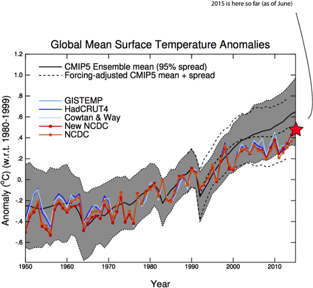
Source: Gavin Schmidt in
https://www.theguardian.com/environment/climate-consensus-97-per-cent/2015/aug/10/2015-global-temperatures-right-in-line-with-climate-model-predictions(who by the way did a pretty much identical plot to the one I linked first). Note also that 2016 will be somewhere around 0.7 in this plot, i.e. DEEP within the predicted model range.
Do I also have to point out the cool period in the past few years here?
Apart from that - I recommend GISS data over HadCrut - better plots, better algorithm. Here:
http://www.columbia.edu/~mhs119/Temperature/T_moreFigs/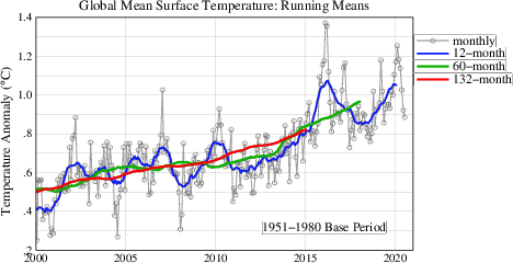
You can easily see that 2015/16 has its running 12 month mean just <= 0.4K over the 97/98, which is in line with the expected warming rate. Nothing outstanding, just looks impressive because of the pseudo-hiatus before. And someone who has always derided people babbling about their imaginary hiatus like you and me (and righteously so) can now not take that imaginary "catastrophic, sudden warming acceleration" seriously. With that we would trespass in exactly the same way as deniers did previously.
If this does not convince you, then please think about what you will be going to tell your favourite denier in 5 years, when they tell you that the global temperature trend is turning negative.
And getting back to the sea ice - we have seen exactly this kind of communication disaster in past years. Over-emphasis of record low years without stressing that there is a very bad trend (and in that case indeed worse than predicted by models, which is simply not true for temperatures...) is the truly important thing. Crying alarm on a specific record has repeatedly opened the door for crooks at What'swrongwithus and the dailymail, and others to just come back 1/2 years later and announce the great increase of sea ice area. So, apart from being un-scientiific, by not relying on proper statistics and comparisons we have repeatedly gotten ourselves into an uphill battle, where lobbyists have successfully imprinted the impression of "it goes up and down, it's just good years vs. bad years" into the public mind.
Or in short: Be aware that while spinning catastrophe scenarios is inherently fun, every public uttering of unscientific "we die tomorrow cries" lends more false credibility to agents of doubt - forcing you instead of the true overwhelming evidence onto a near 50-50 battle with equal opponents.


