That graph us an excellent example. Would you use a simple linear curve for that data? Of course not, it is polymeric in nature. The R2 would tell you that.
I doubt very much if it is "polymeric" in "nature" - whatever that means. Can a graph have a "nature"? And if you are so sure of the R2, why not try yourself?
Me, I am nowhere near good enough at statistics to make such claims, but I have been following Tamino's blog for some years, and he is a true master of the art.
His latest post is actually about this very thing, i.e. how has the rate of warming changed over the last 150 years or so. And funnily enough, he doesn't even mention the "polymeric nature" of the graph.
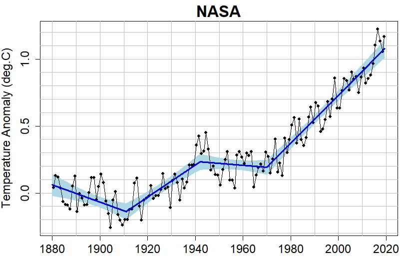
Here, on the other hand, is that graph with some statistically valid change points and linear trends connecting them. This is apparently statistically the best fit to the data. (
https://tamino.wordpress.com/2019/08/20/global-warming-how-fast/)
Just like Gerontocrat has been trying to tell you with his graphs. Using a simple linear regression does not tell the whole story. Does the line in his graphs tell the whole story? Probably not. However, it is a better analysis than a straight line.
If Gerontocrat tried to tell me something, I'm sure that he would succeed. And I do not recall him trying to tell me that graphs have "polymeric" natures, or that his polymeric line is a "better analysis" than a straight line. So what does Gero himself have to say about his polymeric red lines?
But I don't like these red trend lines either. These periodic large rises and falls are just as well represented by an obviously untrue linear projection.
Which is perfectly reasonable. A linear trend is simply the only thing that matches the data we have in any statistically valid sense. And before somebody points this out, I am well aware that the R2 values for the polynomials are slightly better than for the linears, but that is still not valid since these graphs are running averages.
If you run linear and polynomial regressions on the raw data you get identical R2 values of c.a. 0.037 (because of the very large variance, the R2 is quite low), no visible trend changes in the polynomial within the period in question, and a downward trend of 73.000 km2 per annum for both.
Funnily enough, this graph plotting the NSIDC values shows a downward trend of 81.100 km2 per annum, while Gero's SIE 365 day running average linear regression shows a downward trend of 67.291 km2 per annum.

Missing from the graph is the formula y = -0.0811x + 168.03 and an R2 of 0.7803.
The problem arises when people try to extend the linear trend into a linear projection and get different answers from different graphs. So clearly, the linear trends cannot be used to project the zero point. That does not mean that other strangely looking swirly polynomials are going to do any better. To repeat: There are not enough data points in the minimum graph, and the variance is too big to justify anything other than a linear trend.
Selective curve fitting to match ones own beliefs, is one of the reasons that several people have erroneously predicted that the Arctic would be ice-free by now. The Arctic sea ice minimum has not decreased recently. If you refuse to see that from the data, there is nothing more that I can say.
We can agree that selective curve fitting is a no-go. But I can only agree with your statement that the minimum has not "decreased recently" if we always define "recently" as "since the last record minimum".
The problem with your statements, KK, is that you think you can see trend changes in the graph. I claim that the graph has too few data points and too much variance to justify such claims. So the "not decreased recently" is a real thing for now, but has no actual meaning - it is not possible, based on the data, to make claims about a statistically valid change in trend.
That is not to say that there isn't a change in the underlying forces that interact in the high Arctic and give us minimums every year. Perhaps something has changed that makes new record minimums very unlikely, or perhaps that was always built into the system, that the graph would eventually flatline around this level.
And yes, just looking at the graph of SIE minimums can well make you think that this is what is happening. But there is no statistically valid basis to such claims, and probably won't be for another 10 years or so. If, in 2029, we are still hovering around the 4M mark, a change in trend will be statistically valid. Today it is not.
And when you seek weird explanations (such as Feeltheburn's erraneous understanding of meteorology) to explain your non-statistically-valid claims, then we are way into the land of silliness.


