Having discovered that correlation is used to compare model output with observed climate/weather patterns (in Taylor Diagrams), I am now relatively content with using correlation to provide a numerical index of the presence of the summer circulation pattern post 2007. This will have to do anyway because I am now satisfied I don't know enough to use EOFs.
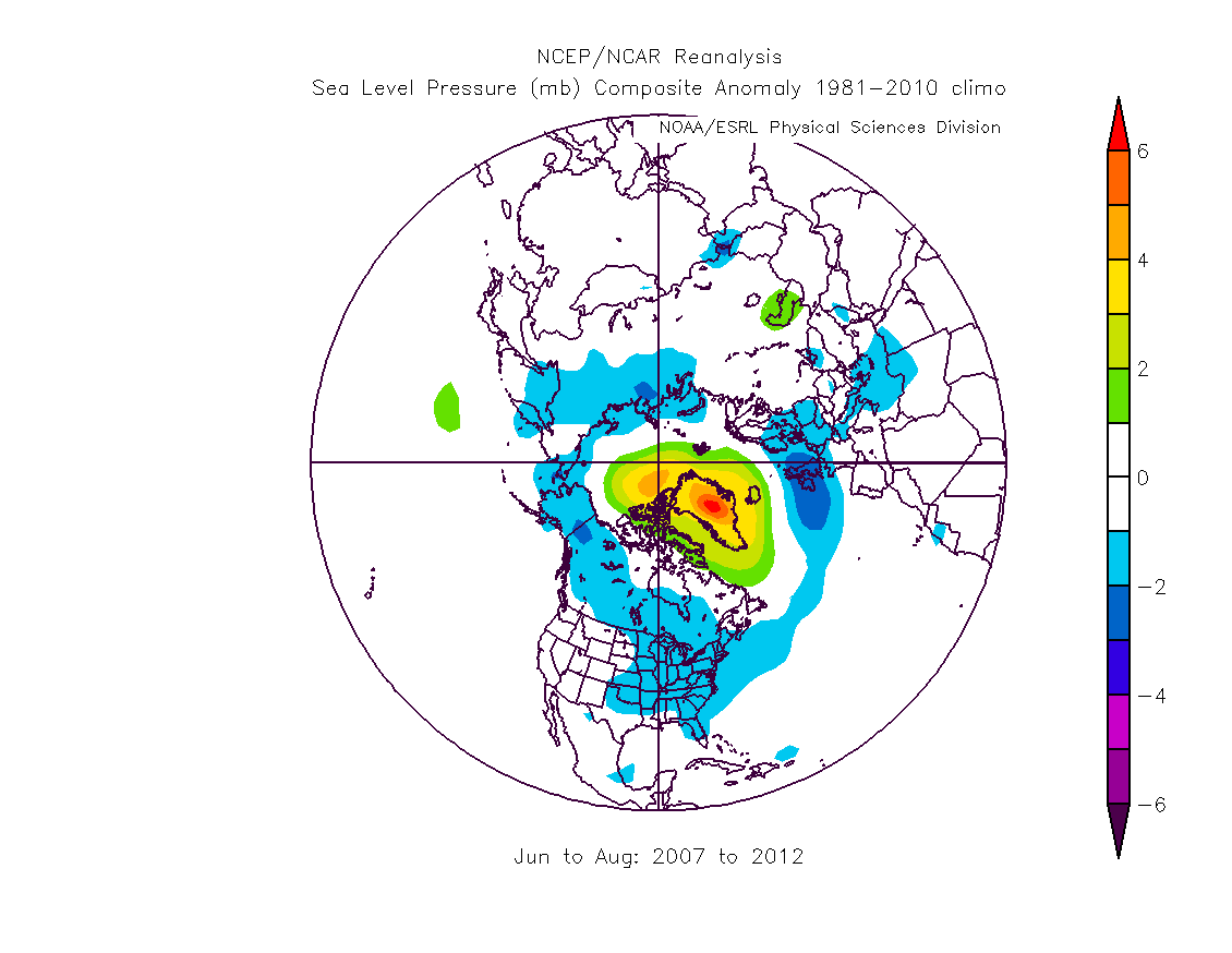
The following plot shows the summer pattern, which is a new pattern post 2007. The plot is calculated as the difference from long term mean pressure for summers from 2007 to 2012, the resultant data set has then been averaged to bring out the strongest repeated features, and plotted.

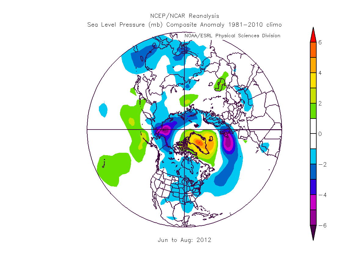
This pattern was strongly present during 2012.

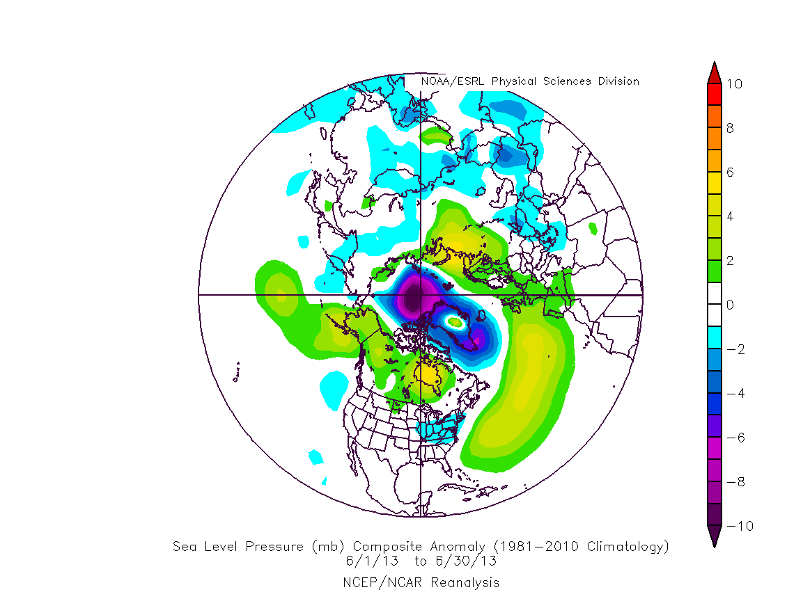
However this June the pattern had reversed.

Which is what has lead to slow volume/area/extent loss in June.
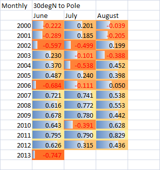
I have downloaded the data used to make those sorts of images for all months from June to August over the years 2000 to 2013 (June). Loaded into a spreadsheet as tables these were then correlated, each in turn, with the numerical data behind the pattern in the first graphic of this comment. This produced a correlation number, the results being tabulated below.
A correlation of 1 means the SLP plots are identical. A correlation of 0 means there is no relationship. A correlation of -1 means that the two SLP plots are opposites, in the sense of one being the negative of the other.

We're now well into July, even without July's data with which to do a similar correlation, it is clear that July will have either a low correlation or a negative correlation. The only feature which could cause a small positive is the high pressure over the Arctic (which is common to the top image of this comment).
