Anyway, both extent and area in the peripheral seas continues to show level anomalies (extent), or climbing anomalies (area).
So... If the peripheral seas had completely melted out today, we would still see rising anomalies while we waited for the historic average to catch up. I'm not sure I like using this anomaly approach. It leads to you saying stuff which sounds like its devastating to certain points of views, but which doesn't mean anything if we take it out of context. And in order to supply the context, we pretty much ignore the sentence and study the graph for awhile to see how 2015 compares to 2012, 2011, and 2007.
Well area is acting pretty much like 2007 and 2011, not 2012. Although the impact of the GAC2012 hit through the recent period.
Anomalies need to be considered in their context, what metric doesn't? But since I have moved to the same baseline as NCEP/NCAR the weather driven components fall out easily.
Take the plot of extent through the summer.
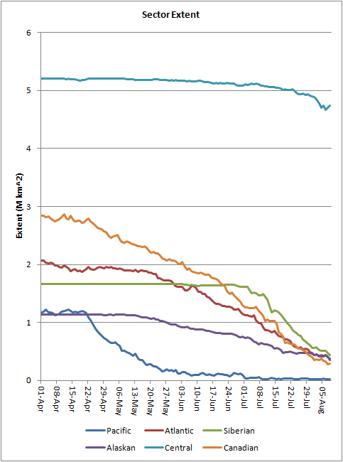
OK. So Central has started to drop, Canadian and Atlantic continue their drops, Siberian is level, then drops after late June. But is any of this unusual, and when you add all those together what roles do various regions play in the overall summer decline? That graph is pretty but, frankly next to useless.
Now consider the same regions (except Pacific which is left out due to phantom ice in the source data), but express those regions as difference from the long term average for each region (for each day), i.e. anomalies.

The seasonal cycle has been removed so we can see the wood (forest) not just the trees.
As the different regions are stacked, and the amounts of positive anomalies are negligible, the lower edge shows the overall departure from the average, and we can see what causes the departure. So the feature that screams out is the strongly above average loss in July, before July regions were below average but the losses were about average, so with a constant offset the overall anomaly was level, and the contributions from various regions remained about the same. But from early July / late June overall loss went well ahead of normal, and with the regions stacked it is clear where that was happening.
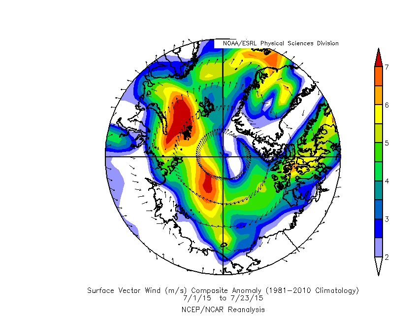
So I turn to weather data for that period. Temperature at the surface is next to useless, we cannot tell whether warmth causes ice loss or warmth is due to ice loss. So we can look at sea level pressure, or the surface result; winds.
1) What caused the severe above average loss in the Siberian sector (ESS & Laptev) in July?
The drop in anomalies happened from around 1 July to 23 July, so what were surface winds doing in that period? We have a very unusual drop in extent in the context of the 1981 to 2010 average in the conglomerate region of ESS and Laptev, we're looking for something equally unusual in the winds expressed as an anomaly from the same baseline period over the same area.
2) What caused the levelling after 23 July?
We're looking for some reason why losses returned to normal levels, whatever was unusual in the weather for question 1 should have returned to more normal levels.
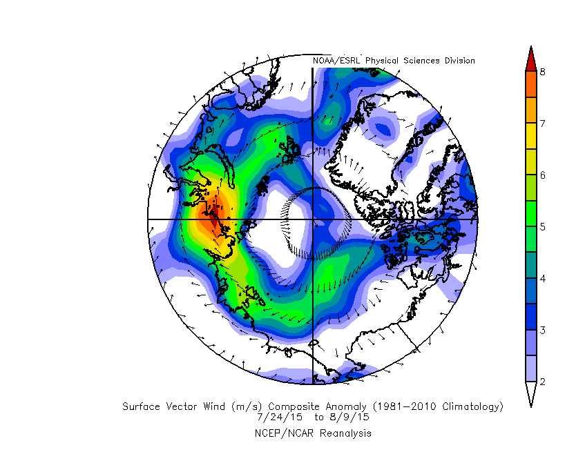
So question 1 is answered by the strong dipole anomaly winds, as discussed in various papers in the literature. Question 2 is answered by a lessening of the dipole driven winds, and likely a change to winds pushing ice into the ESS and Laptev acting against retreat of the ice edge and keeping losses at more average levels.
It is just my opinion, you may disagree, but speaking for myself: Anomalies beat the crap out of just plain unadjusted metrics. Yes, they take a bit more work, but they repay that work. When the tandem of weather / ice to the same baseline fails, mostly there is reason to suspect another factor, like multi-year ice or ocean heat.


