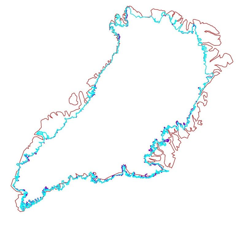
I have finally taken time to finish a comparison for the Greenland icesheet between 2009 and 2012.
I will produce a justification, but first let me expand on the result:
Greenland icesheet and snowcover extent comparison:Year contour/circumference surface
2009 47967 km1 1.819.626 km2
2012 55308 km1 1.792.659 km2
Given these data, the surface retreat in three years was
26.967km2. This implies a mean contour retreat of about
560m1.
JustificationI selected the best MODIS tiles available for the second week of July 2009 and 2012. After fitting these in a CAD grid, I created a polyline representing the continuous ice-/snowline. Within the limits of resolution the polyline has about 3 vectorpoints per kilometre. Close to the 250x250m2 MODIS-pixel.
The complicated and difficult factor is a just and consistent allocation of these vectorpoints. I spent a lot of time on blurred parts of the MODIS images. On the tour, I interpreted variable situations. Calved glaciers, occasional snow left after summer night precipitation, jokullhlaup debris fields looking like ice or snow but probably signifying broad sandrs where the precipitous meltwaters excited the glacier contours July 2012.
Maybe a consistent interpretation could be done through a program using set parameters. The weakness is that no parameter would be competent to judge different objects as they are represented on these MODIS images. No individual would reproduce the exact choices I made to set the polyline. My endeavour may be vain. But you may find the result satisfying as an indication that it supports evidence of a consistent retreat of the GIS in line with for instance GRACE data.
To end this justification, I add that I left out any snow- or icefield not connected to the main Greenland ice sheet. Remaining fast ice has been cut out too. I’ll illustrate some details and interesting differences later.
For now, it seems right to indicate that some areas near Qaanaaq and the Steenstrup Glacier (NW GIS) gave the most difficulties for 2012 interpretation.
That doesn’t wipe out the general picture. There’s a consistent retreat of the snow- and ice contour, most obvious in the SE and South. It isn’t dramatic yet, but it is well in line with a pattern leading to a mean 4 km1 contour retreat producing about 3000 Gt of mass loss a year within a couple of years.
I did expect the process to advance smoother through the years. I didn’t foresee ’13 to be a minor melt year. Nevertheless, the extreme melt years to come will make up. In my opinion it will fit in a stage around 2050 where a large part of the southern tip of the GIS will have been severely reduced. That will equate to a global sea level rise of about 50 cm.
Sea level will rise in line with several stages of vulnerability on the large ice sheets around the globe. In my opinion, the Southern tip of Greenland is the most vulnerable.
On the map above, red is the simplified coastline, blue the overlying contour for 2009, the purple bits relate to the 2012 contour, that is obviously not dramatically different in July 2012 on this scale.


